Data informed design for a window decorator
People measured their windows at home, carried the numbers to a store and hoped. So the online decorator was rebuilt from what the analytics and the shop floor showed together.
- Kwantum
- UX researcher and designer
- Two designers, a researcher and a data analyst at Aviva Solutions, with Kwantum store staff
- Research through to launch
The problem
Kwantum has more than a hundred stores in the Netherlands and Belgium, and around twenty five thousand webshop visitors a month. Window decoration was the awkward part. People measured at home, carried the numbers to a store, handed them over at a desk and hoped. That gap cost sales in both directions: people gave up online, and people who did make it to a store often arrived with the wrong measurements.
How do we improve engagement with the online window decorator so it drives sales more quickly?
What we tried
A store and a screen tell you different things. The useful part was joining them up. Where the analytics showed people leaving the decorator, the stores showed what those same people did next. That is where the improvements to the online flow came from.
- Data analytics on the decorator they already had There was traffic through it and behaviour to read, so the drop off points were already recorded. That tells you where people stop. It does not tell you why.
- Field studies in Kwantum stores Watching people arrive at a desk with measurements they had taken at home, and watching staff deal with the ones that were wrong.
- Synthesis, into a service blueprint The drop off points did not end online. People left the decorator and turned up in a store carrying their measurements, so the two sets joined into one blueprint, and the improvements the online flow needed were easy to spot on it.
- Concept and usability testing Concepts first, to work out which solution answered the problem, then usability testing on the flow to settle which version of it was the best one.
The design
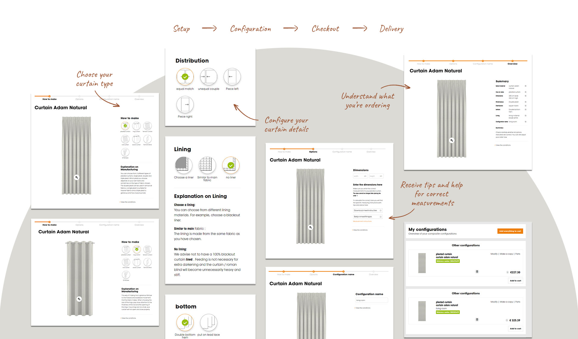
The decorator walks someone through the whole thing in order: measure, choose, see it, price it, buy it. Nothing asks for a decision the person has not been given enough to make yet. So the measurements come first, and the price only starts moving once there is something to price. Three of the choices inside it are behavioural. Those are the ones that decide whether somebody finishes.
-
The pain of paying
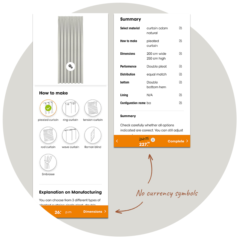
People hesitate at the moment money becomes visible. Currency symbols come off throughout the decorator. That makes the running total easier to sit with, so people keep configuring.
-
The Zeigarnik effect
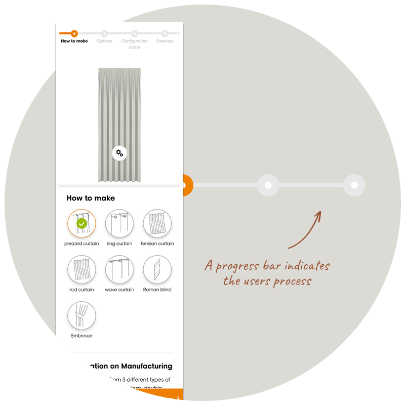
Unfinished tasks stay active in your head. A progress bar gives a long configuration a visible end. People finish the ones they can see the end of.
-
Consistency and feedback
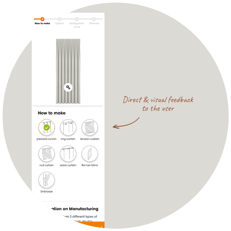
Every choice has to show itself immediately. Pick a different fabric and the curtain changes. Pick an option and it is clearly marked as picked. People do not trust a configurator that stays silent.
Outcome
Engagement with the decorator rose by 25 percent, and shop visits rose by 25 percent across online and offline together. I worked at Aviva Solutions at the time. Aviva did the build and the platform integration on Sitecore.
The numbers
More visitors completing the decorator flow, measured after launch.
Increase in online and offline shop visitors over the same period.